EGConnect by Ethos Group is a one-stop solution for partner automotive dealership employers to view and manage incentive statements for their employees ("participants").
Timeline
June 2021
(1 month)
My Roles
UX Researcher
UX Designer
Deliverable
Interactive
Prototype
Tools
UserZoom
Figma
Type
Internship
(Individual work)
EGConnect had already been in-use by 1.5 K+ dealerships when I started the project. To use the web app, employers must first onboard participant accounts on the Participant Management page, and my job is to make such process more intuitive and efficient.
Problem
Employers have a hard time setting up participant accounts on Participant Management because the Participants' current account set up status and user actions are unclear.
Business Goal
Understanding and meeting dealerships' needs to increase customer stickiness and profit.
Solution
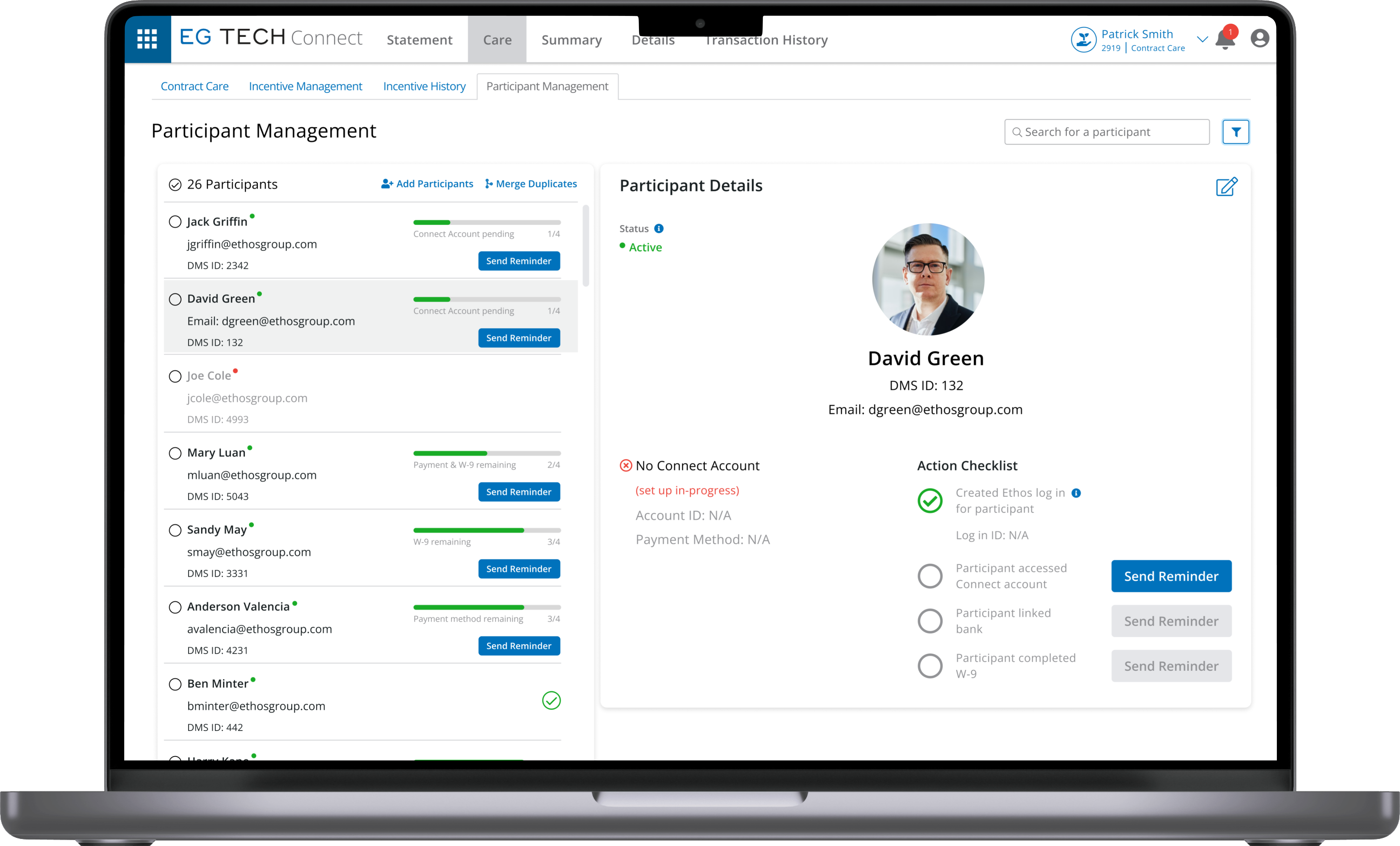
A brand new view for Participant Management - a two-panel selector that allow employees to efficiently track Participant account set-up progress and take appropriate user actions.
User Research
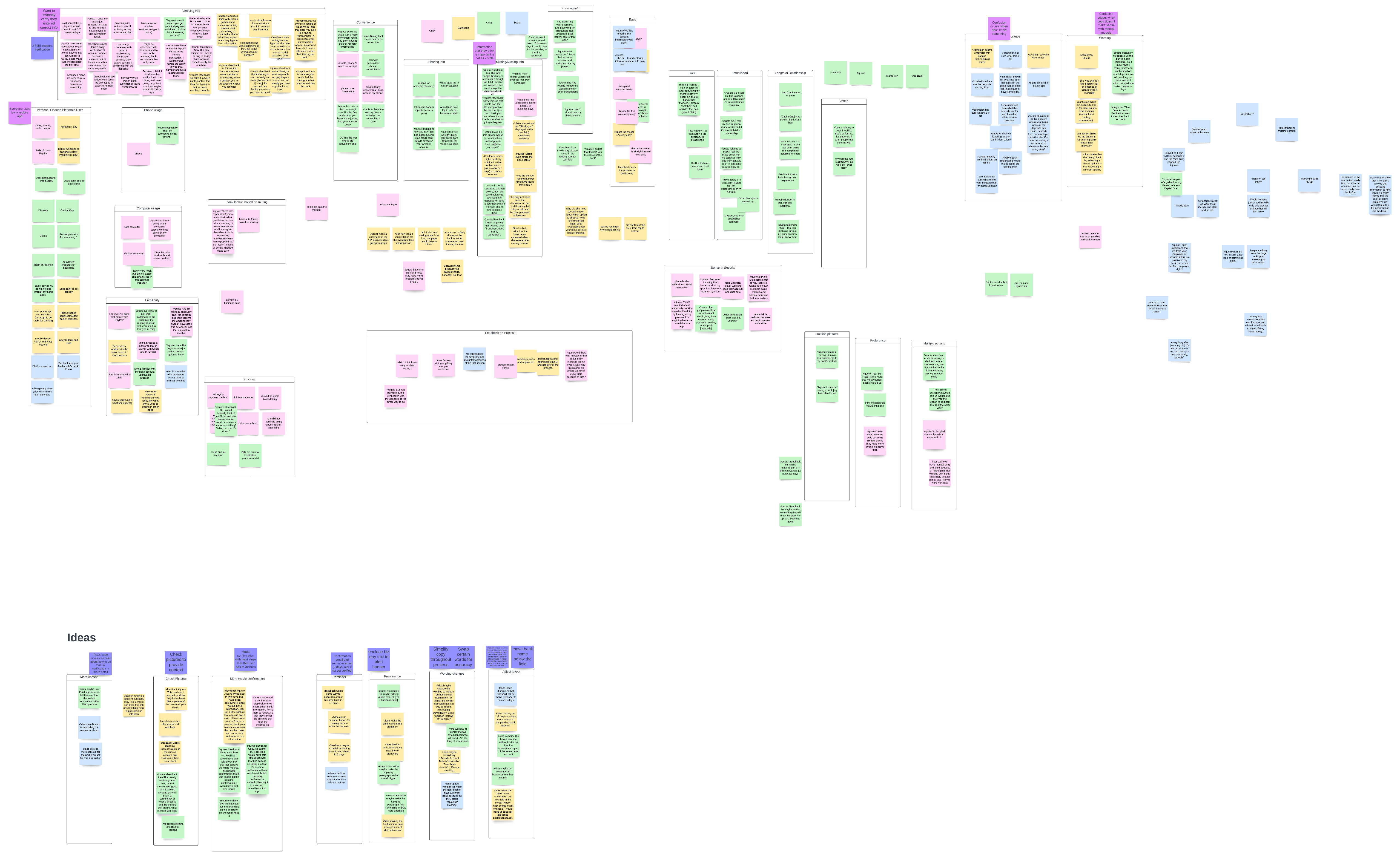
To understand user pain points, I interviewed and collected feedback from car dealership employers and Ethos Group Reps who consult for them. Here are the insights that I found:
1. Unclear Order and User Action
When I take over the project, Participant Management "expects" its users to set up a Participant's incentive statement by following 4 steps and take the appropriate user action in the order showed in the flow chart below:
- Created Ethos Log In for Participant
- Participant activated (i.e., accessed) Connect Account
- Participant linked Bank Account
- Participant submitted W-9 Form
The users, however, do not understand this flow due to the confusing and lack of signifiers.
2. Confusing Signifiers
Ethos Login Account and Connect Account are two separate systems and the former is a premise of the latter. Yet in the current design, they are over-abbreviated as "Login Account" and just "Account", respectively. Users always gets them mixed up.
3. Limited Visibility & Too Many Clicks
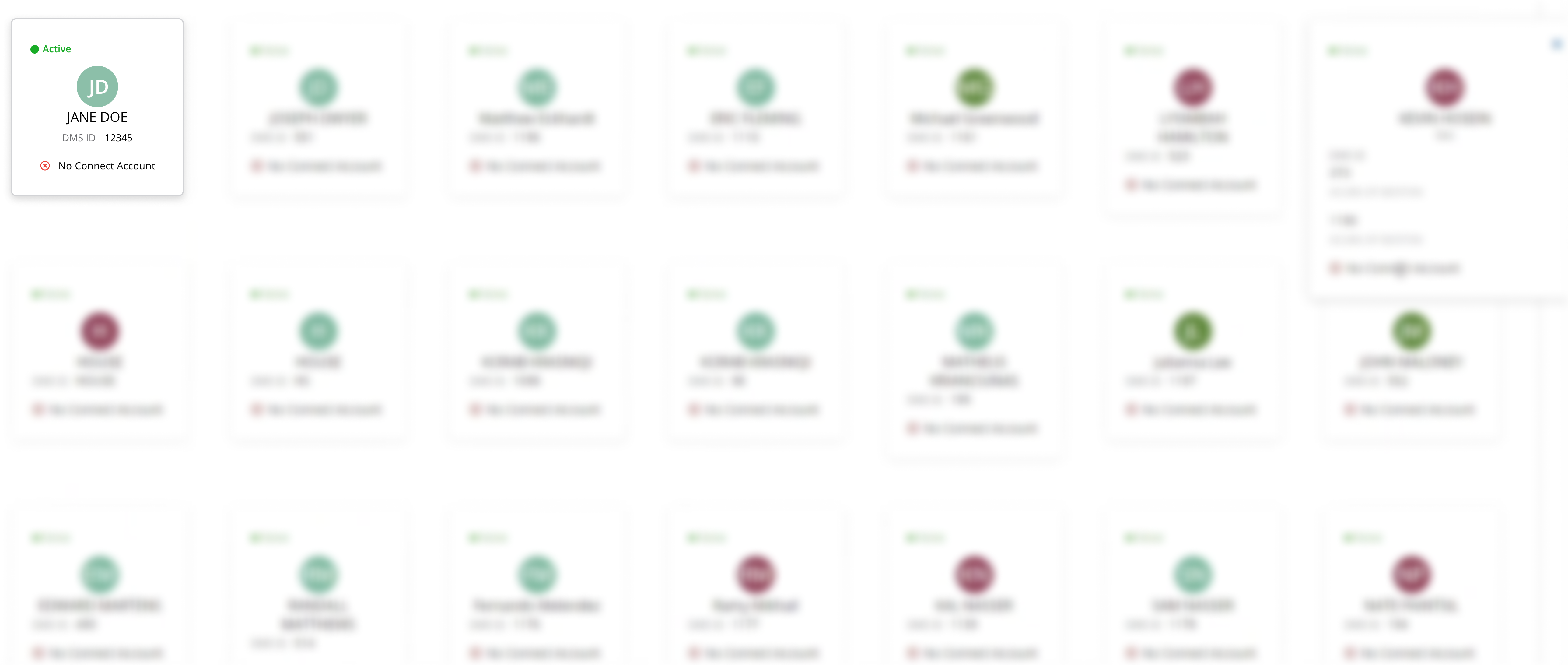
Currently, Participants are displayed in a card grid. This view prevents users from directly accessing important information about and action items for statement set-up progress. Also, checking and updating statuses for multiple Participants is very time-consuming:
User Journey Map
Brainstorming & Ideation
Following interviews and journey mapping insights, I came up with the following 3 HMWs:
- HMW make signifiers in the incentive plan set up process clearer?
- HMW help users understand the set up process and which actions to take in each step?
- HMW help users save time on viewing and acting on multiple Participants at once?
Through these, I was able to narrow down my ideas into 3 solution spaces:
1. Double-Panel View:
Preview & Detail Cards
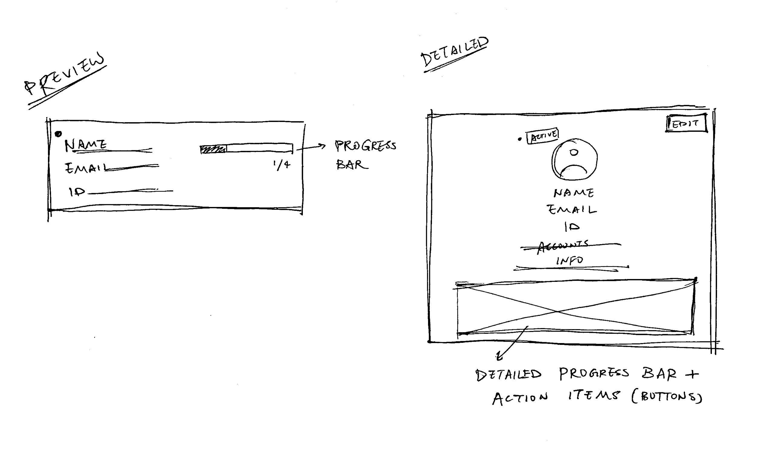
My first idea was to provide easier access to both collective and individual Participants information by replacing the current the card grid with a Gmail-like double-panel view. On the left, users would see a list of Participants preview cards that each includes credentials and a set up status progress bar. Once the user clicks on a preview card, the right panel will display details of that Participant's information and progress, along with buttons for the appropriate user action for each step. Users will now be able to see both an overview of all Participants' statuses and onboard a focused individual simultaneously.
2. Action Checklist
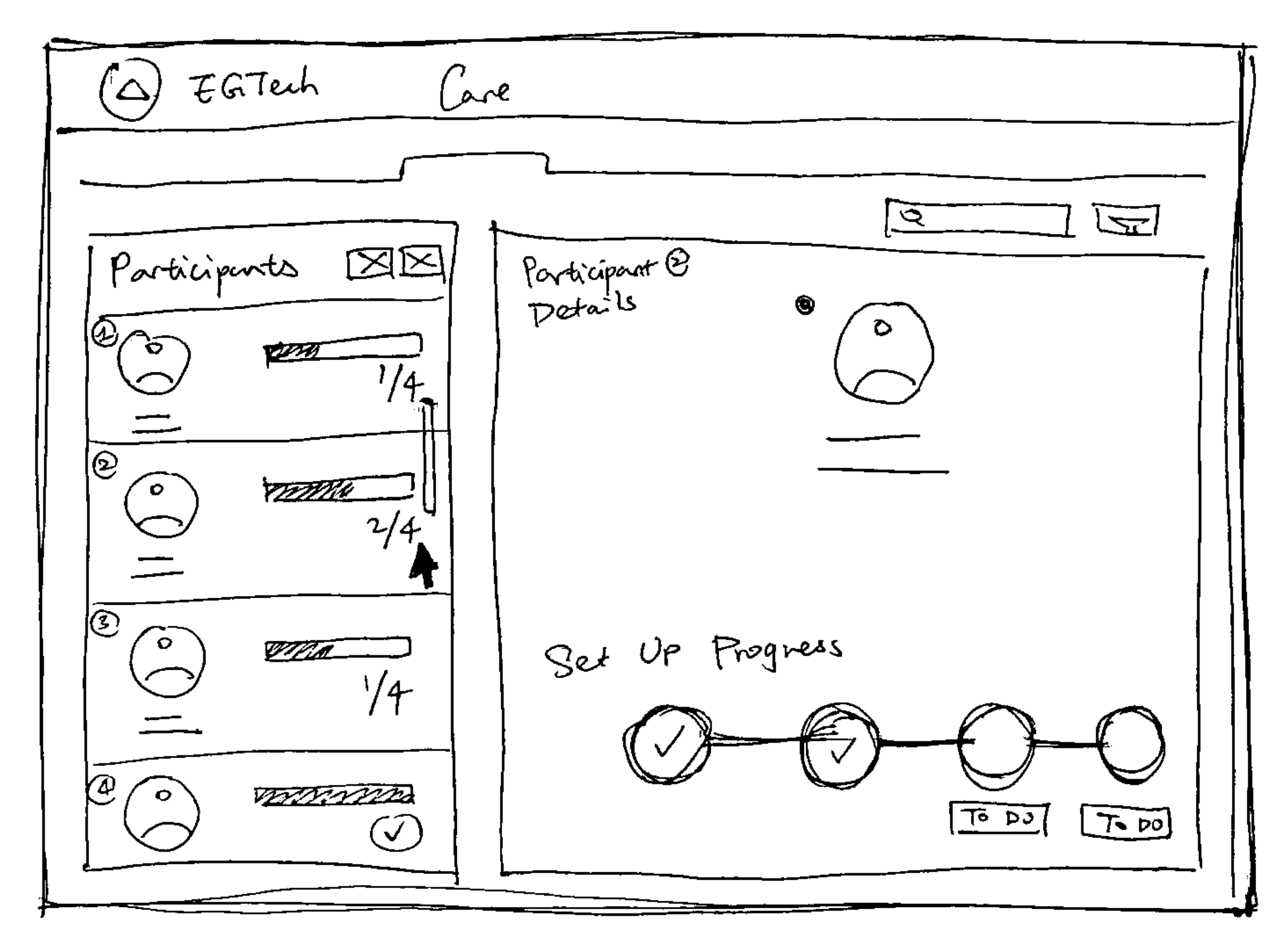
To help users better understand the order of the set up steps, and more importantly, which action to take for each uncompleted step, I plan to integrate an action checklist with the progress bar on the Participant Details panel. I will label the to-do buttons with intuitive signifiers and clear language.
3. Bulk Actions
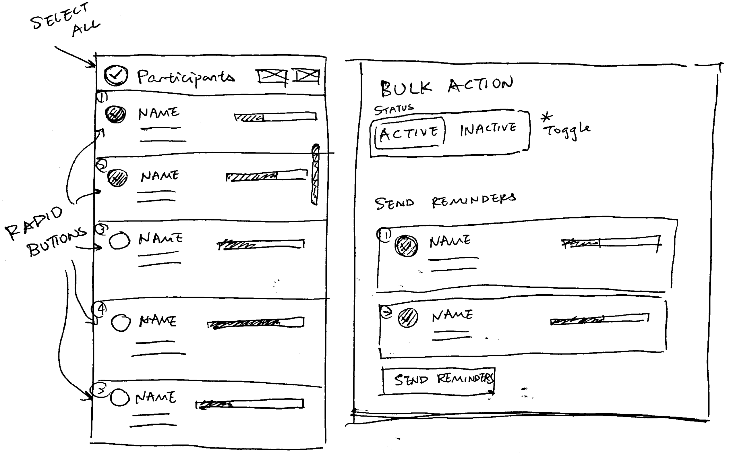
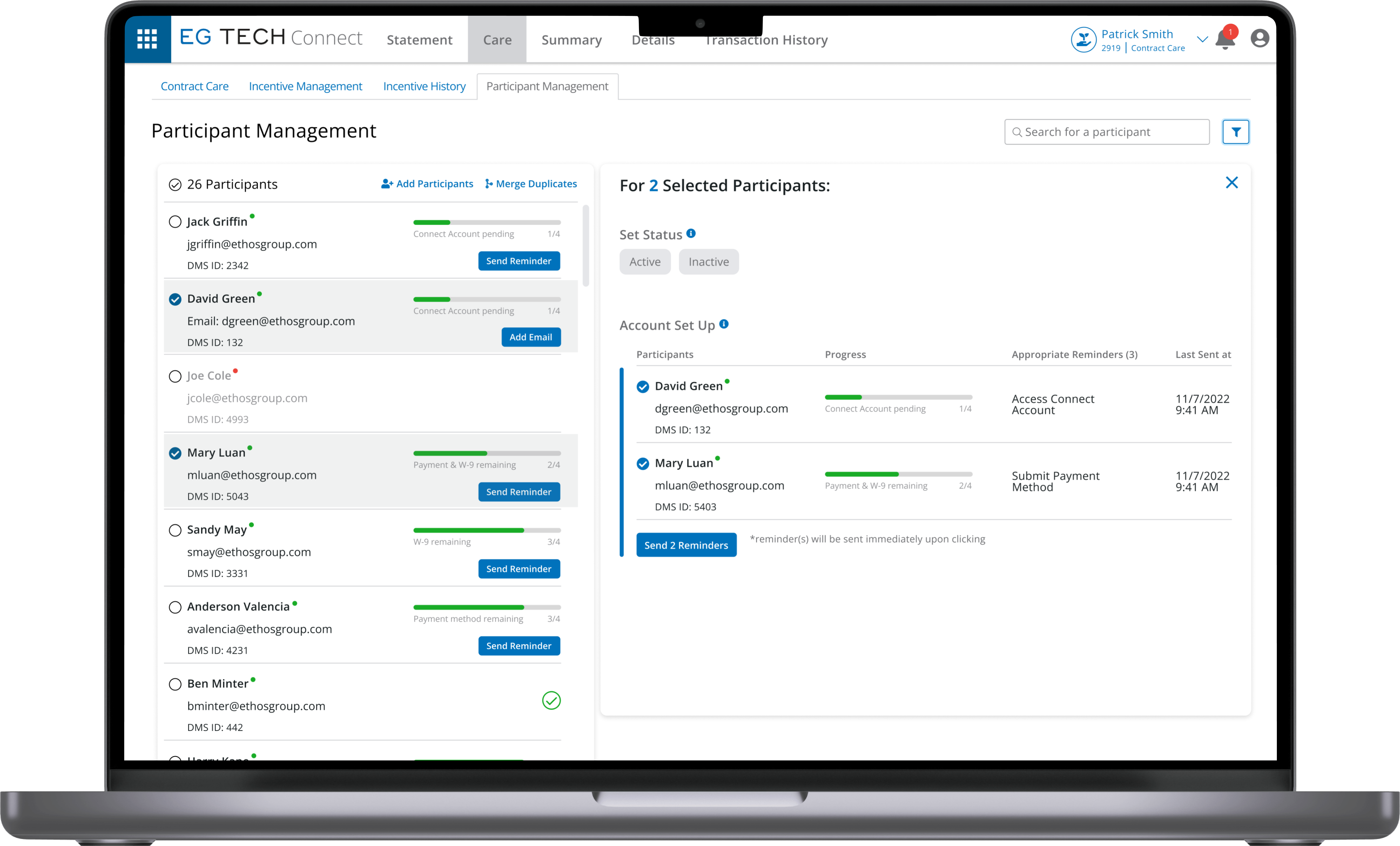
Finally, my third idea tackles the user pain-point that managing multiple Participants takes too much time. This bulk action feature will afford selecting and implementing appropriate actions for multiple Participants with only two clicks. Also, a Select All buton will be available.
Mid-Fi Explorations
1. Preview Cards
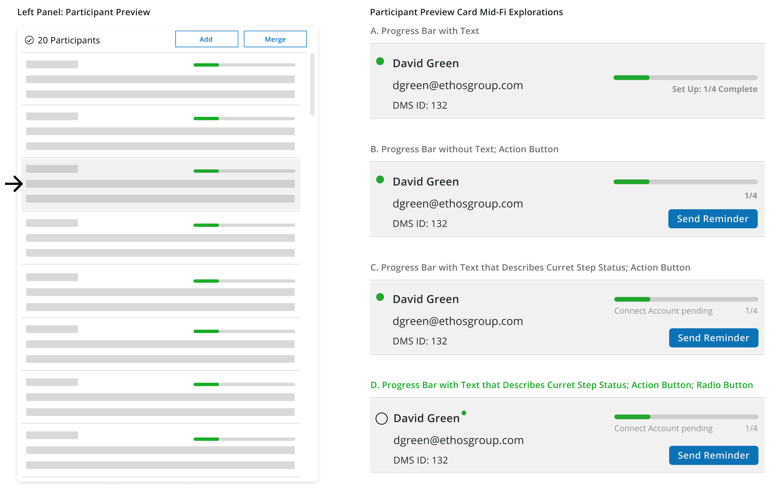
Following feedback from crit, I explored adding an action button for the next uncompleted step on the cards in order to increase user workflow efficiency. I chose D, because D has both intuitive and step-defining labels for the progress bar and a bulk action selector.
2. Action Checklist
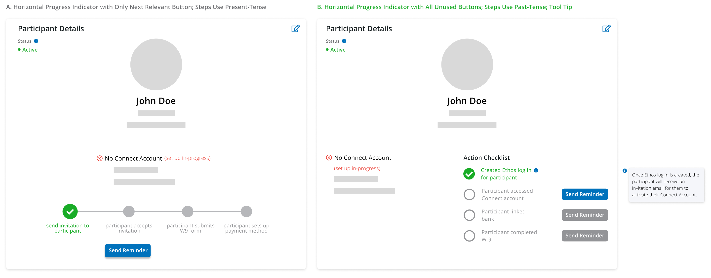
I chose B for its better usability. B not only is more readable with its vertical list UI, but also shows all TDB action buttons, which gives users an overview of the entire process while having clear constraints. Moreover, the extra tool tip also explains the most confusing step.
3. Bulk Actions
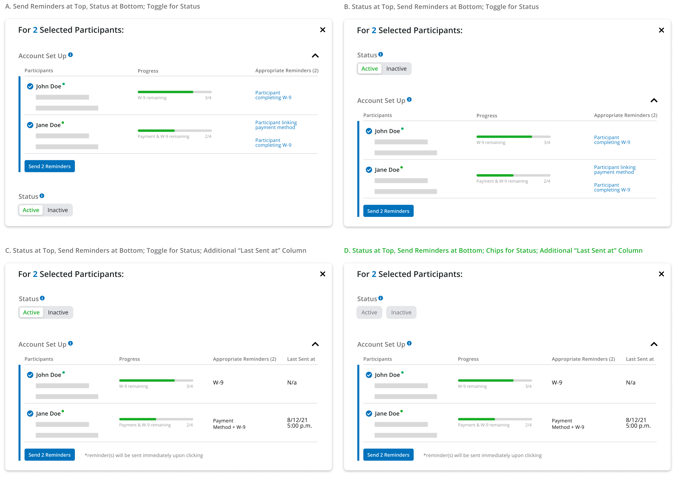
I chose D for the following reasons:
D shows the Status selector above the Account Set Up table. Having an Active account is a premise to the entire set up process.
D uses chips instead of a toggle for Status. In Bulk Action, the 2+ selected Participants may not share the same status. So the default state of Status cannot be either Active or Inactive, hence no toggle. Setting the default as unselected chips works.
D has an extra "Last Sent at" column in the Account Set Up table. In usability testing, users reported that sometimes they have to send multiple reminders to unresponsive Participants. The sent date and time of the last reminder will thus be a useful reference.
Hi-Fi Solutions
1. Participant Details
2. Bulk Action
Looking Forward
Completed in my first FinTech internship, this project was challenging in every possible way. From adjusting to Ethos Group's design process and interviewing with real-life stakeholders, to learning knowledge about the automotive industry from scratch, I had grown so much as a UX designer.
The most valuable lesson I have learned from working on this project is that I should ask for feedback constantly, and from different stakeholders. Every single decision I made during the design process needs to provide high-level usability and UX, abide by company goals and policies, and contribute to client needs. Design is never a one-person job!
Finally, I would like to thank my manager Bill for his caring and inspiring mentorship, colleagues Floria, Brannon, Stevie, Ricardo, Megan, Adam for their insightful critique and advice, and everyone else at Ethos Group for this amazing opportunity!
© Hank Lin 2023
