Re-appreciating Saved posts on Instagram. A personal case study.
Timeline
April 2020
(1 month)
My Roles
UX Designer
UX Researcher
Deliverable
Interactive Prototype
Tools
Figma
Miro
Type
Case Study
In 2020 I noticed a common Instagram user behavior: people would always hit the bookmark icon to save posts, yet hardly ever find or view them again. It seemed that the Save feature is losing its value. So I asked myself: “what goals do users have when they save a post, and how can I help them better achieve them?”
Problem
There are two types of posts that users save.
- When users save an unsophisticated post that is "too good to just deserve a like," they may or may not intend to return to it at a random point later. But if they do, they have a hard time navigating to Saved and finding their post.
- When users save a long, usually educational post, they plan to return to it soon to derive value. Besides the navigation problem in 1), they also struggle to remember the saved post itself.
Business Goal
Increase value of individual posts and in turn increase user engagement rates.
Solution
Enhanced signifiers and navigation with unique flows for the 2 different types of saved posts.
User Research
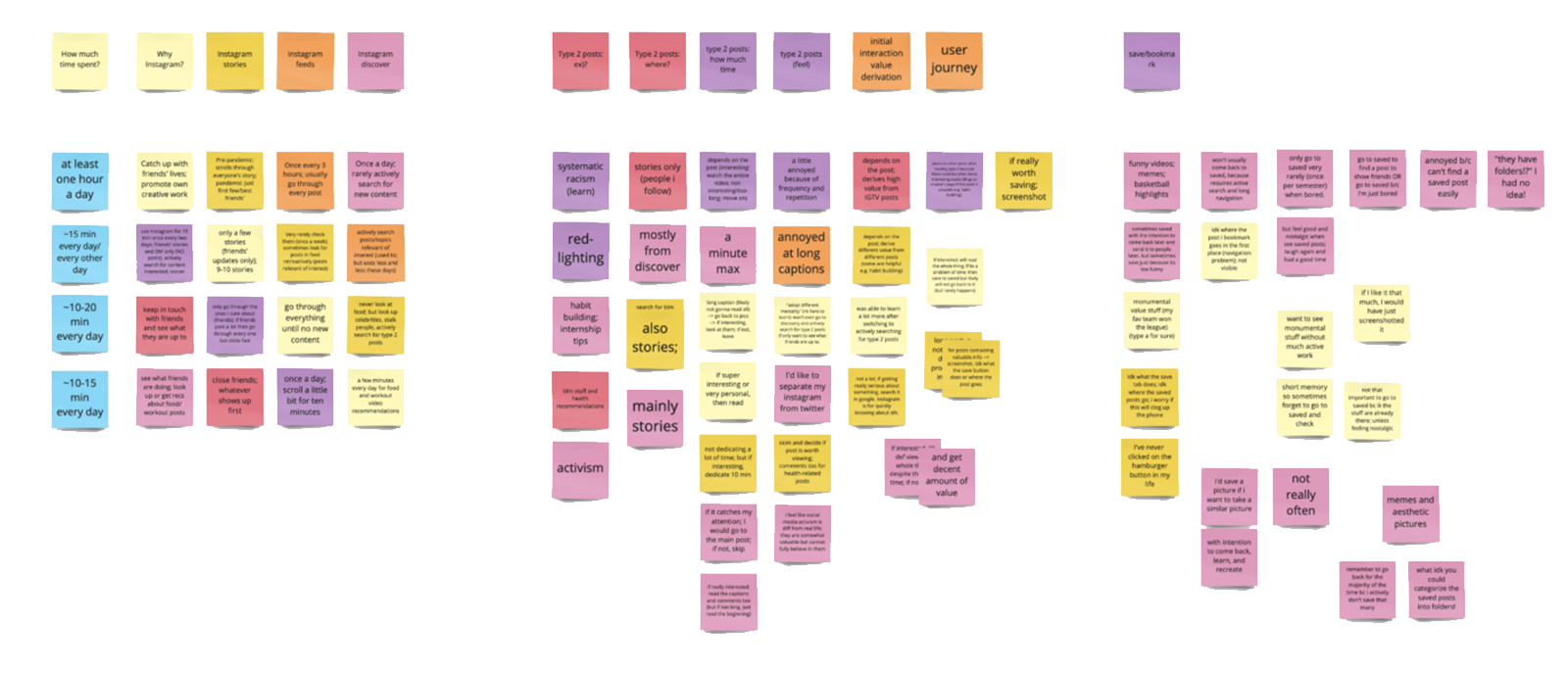
Aiming to test out my problem hypothesis, I interviewed 5 Instagram users on their post-saving habits. Here, I found one of the most important insights:
There are two types of posts that users save, and users save them for different reasons and purposes.
Credit: @natgeoadventure
Type 1: The "Super-Liked"
Saved because "they are too good to just deserve a like," e.g. this shot of the moon.
When saving, users may or may or may not have the intention to return to it later.
User may want to find it in Saved at some random point in the future (e.g. to share an old yet funny post with a friend).
Credit: @bbcnews
Type 2: The "Finish-Later"
Saved because they provide valuable, often educational information, and are too long to finish during initial interaction, e.g. this BBC report on UN's new climate change analysis.
When saving, users almost always want to return to them sometime soon to finish viewing in order to derive more value.
Type 1 Post Insight
Users express little need to revisit a Type 1 saved post soon after saving.
“That meme is funny but I don’t really need to see it again the next day…I might look for it in my folder if I want to share it with my friend should something remind me of it in the future.”
Type 2 Post Insight
Users express great desire to derive more value from a Type 2 saved post in the near future (but they always forget to do so).
“I didn’t have time to finish reading the long caption [of a social justice post] so I saved it for later that night. But I totally forgot about the post itself and the fact that I had saved it.”
General Insights
75% of the interviewees are unfamiliar with part of or the entirety of the post-saving process, especially the concept of Collection.
"Wait...what is a Collection? What does ‘Save to Collection’ mean?”
88% of the interviewees cannot remember how exactly to navigate to their Saved posts. 100% have made mistakes navigating to Saved.
“I know it’s hidden somewhere in my Profile page but idk where exactly…”
Ideation
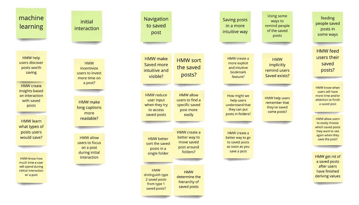
I recruited my friends Emmanuel and Jeremy for an initial brainstorming session. We came up with a list of HMWs that would help address both Type 2 and general problems:
- HMW help users better remember their unfinished Type 2 saved posts?
- HMW let users determine which posts are Type 1 and which posts are Type 2?
- HMW we help users navigate to Saved easier?
- HMW help users understand the post-saving process better?
These HMWs guided me to come up with the following ideas:
1. Intuitive Collection
Collections are optional, user-created folders within the Saved page that help users categorize and find saved posts. However, users have a problem understanding its concept:
"I thought by tapping on the bookmark icon I've already saved the psot; why do I have to 'Save to Collection' again?"
As a result, many users are not using the powerful Collection feature for categorizing posts. This makes finding a specific saved post harder. To help users form a clearer mental model on both Saved and Collection, I ran a round of Crazy Eights.
2. Enhanced Discoverability
The Saved page is hidden deep inside the hamburger bar on Profile. Even as a secondary feature, it lacks discoverability. I brainstormed where I can move all Saved posts to, so that:
- if needed, users can navigate to Saved easier, so that they can find a specific Type 1.
- the more discoverable Saved can trigger users to remember their unfinished Type 2s.
3. Enhanced Memories
In addition to the previous two brainstorms that target all Saved posts, I need to ideate for Type 2 posts specifically: HMW help uses better remember to finish viewing them soon?
I started with market research. Among many content-based products, Medium stood out.
Screenshot from
Medium
Medium offers informative and educational content similar to Type 2 Saved posts.
When users reopen Medium, the app shows a toaster that reminds users to finish their most recent unfinished saved blog post. A simple tap will lead them to that post.
Medium’s approach, however, isn’t 100% suitable for Instagram. Instagram users don’t want to finish reading every single Saved post; they only want to finish their Type 2s. My solution should thus afford the option to choose whether to set up a reminder.
And my best idea is showing the reminder setter right after the user saves a post. This way, the user has the freedom to determine whether they want to get reminded to finish viewing it, and if so, how soon. Now, they can easily complete any of the following four possible tasks:
- Just save the post to the general Saved page (i.e., no Collection).
- First save the post, then add post to a Collection.
- First save the post, then set a reminder.
- First save the post, then add post to a Collection, and finally set a reminder.
Mid-Fi Explorations
1. More Intuitive Snack Bar
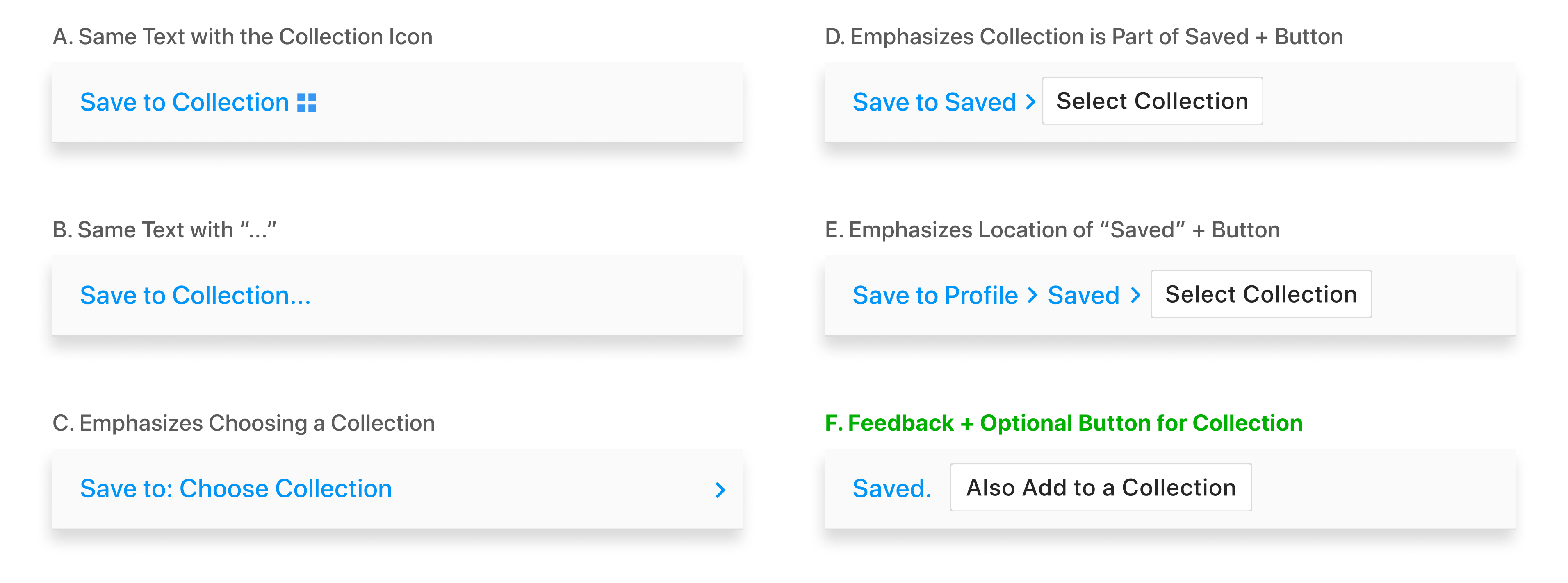
After Crazy Eights, I settled on improving the existing snack bar that pops up after saving a post. Concerns with user's ability to adapt to new concepts is the main reason why I did not explore replacing Collection folders with tags or renaming/replacing the icons for Saved.
I chose F, because its text-button combination conveys the clearest messages:
- “Saved.” gives users the feedback that the post is saved.
- “Also Add to a Collection” is an actionable item and therefore is a button.
- The word “Also” means that action is optional AND taking place after saving the post.
- The verbs “Add” for Collections vs. “Save” for posts help differentiate those two actions.
2. More Discoverable Saved
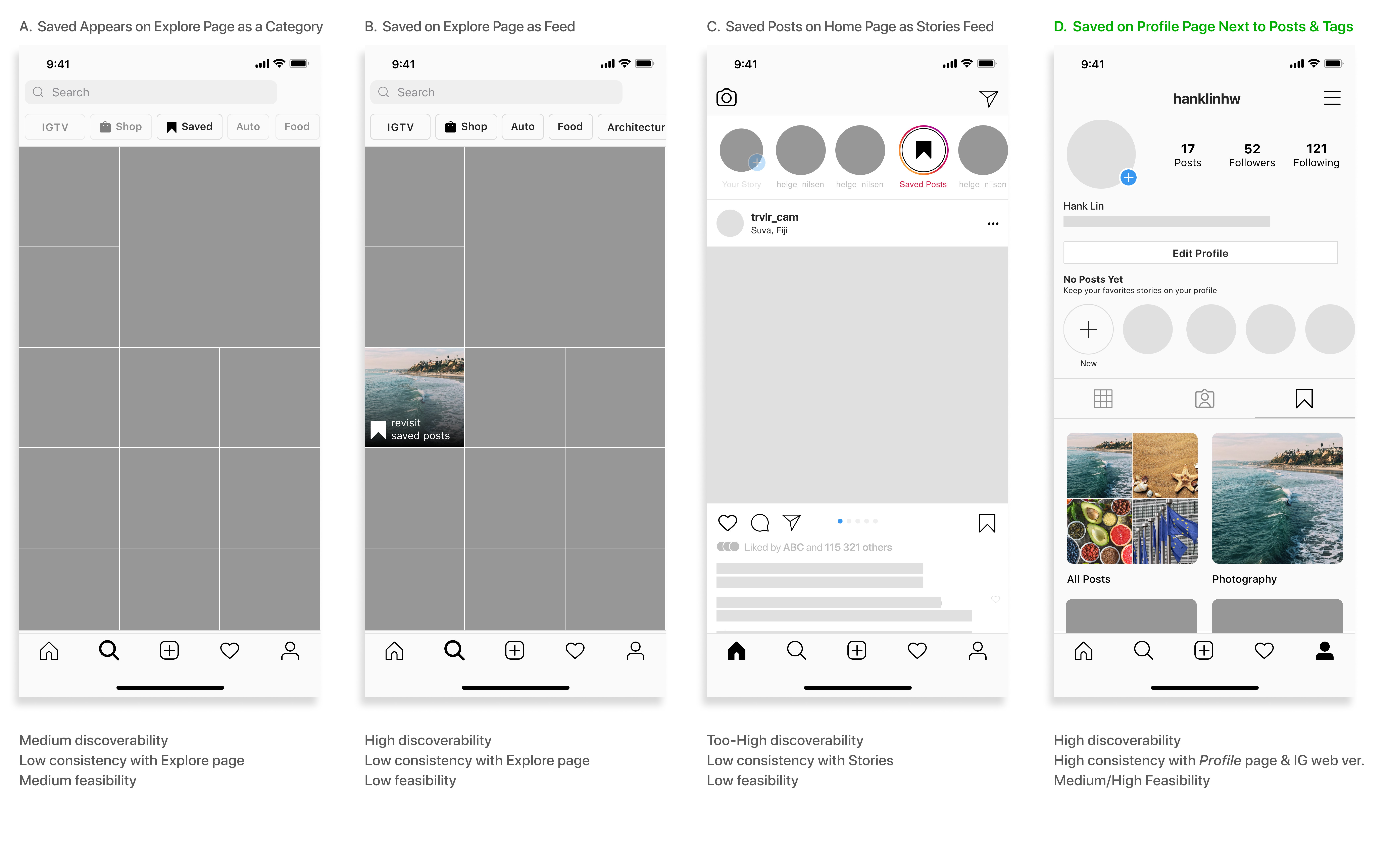
I settled on D, because:
- Users interact with the Profile page often and will discover the relocated Saved easily.
- Users expect to find Saved on the Profile page (Saved is now on the Profile page AND the fact that saved posts are personal information that belongs to the Profile page only).
- The current web version of Instagram puts Saved in the same position.
- Moving an item within a page is more feasible than to another page.
3. Reminders
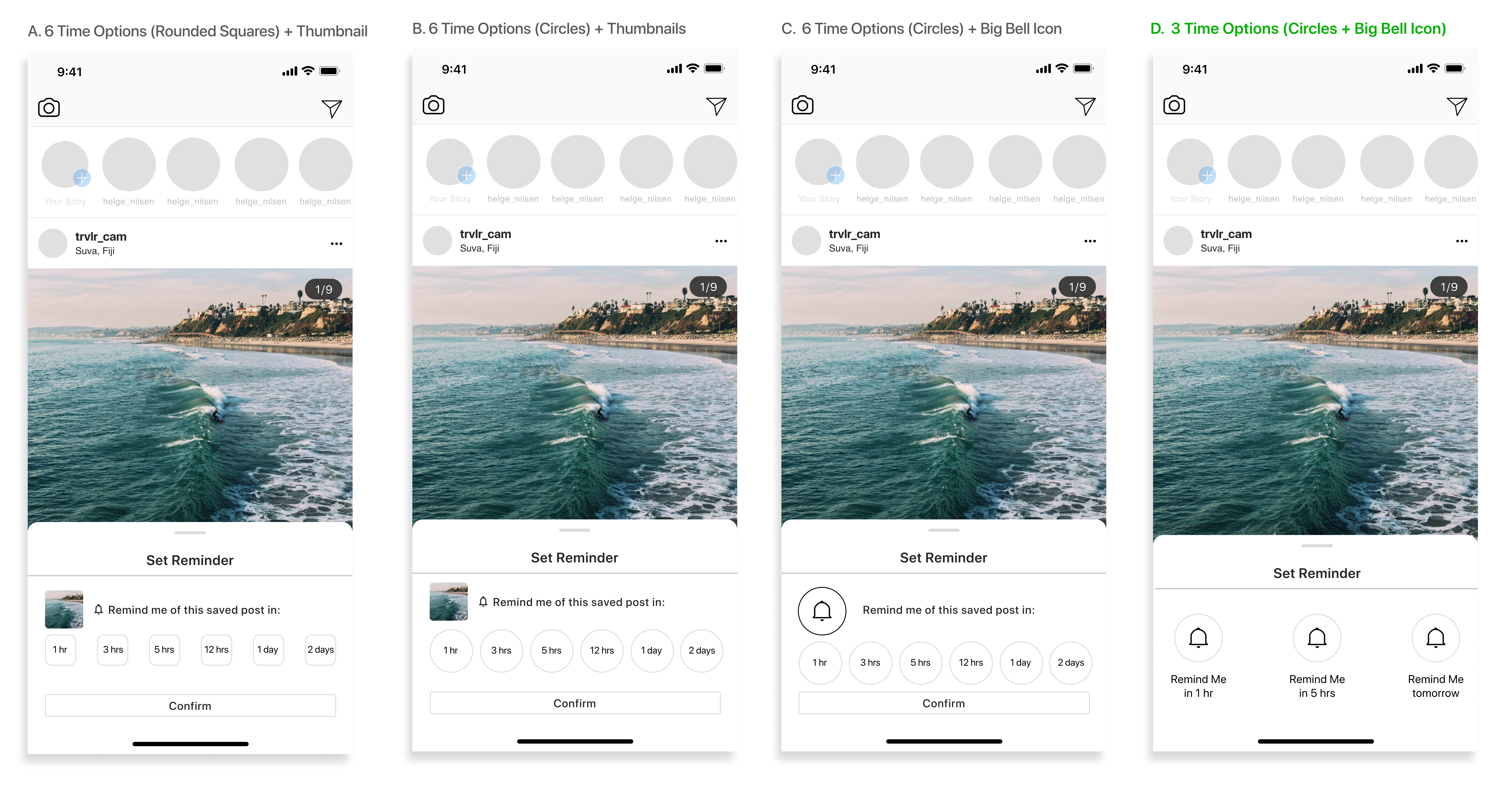
For the Set Reminder action sheet, I explored different time options and the UI design. I chose D, because:
- The saved post thumbnail is unnecessary.
- User testing shows 3 time options are enough; 6 could be overwhelming.
- D’s circular buttons look consistent with Instagram’s current design Kit.
Hi-Fi Solutions
Top: enhanced discoverability for all saved posts. Bottom: reminder system for Type 2 Posts.
Looking Forward
This case study has taught me a valuable lesson for my future design journey: I should never commit too early on defining a user problem without conducting user interviews.
This case study was completed prior to the the Fall/Winter 2020 Instagram update. As Instagram added a new in-app shopping feature, tackling potential problems in saving and finding saved products emerge as new opportunities for this study. Also, now with more time, I plan to upgrade my Hi-Fi prototypes by using advanced animation tools.
Finally, this is my first comprehensive UX case study, and I’d like to thank my project team CornellDTI as well as Cedric Castillo, Emily Chan, and Chris Tae Seo Lee for their great mentorship and advice!
© Hank Lin 2023
