Office Hours Simplified™. Enhancing information-sharing from TAs to students in queue. A Spring '22 two-week design sprint.
Timeline
April 2021
(2 Weeks)
My Roles
UX Designer
UX Researcher
Deliverable
Interactive Prototype
Figma
Figma
Type
Project Team
(Individual Work)
Queue Me In by Cornell Design & Tech Initiative is an online office hour web app that is proudly supporting professors, TAs and students in 17 academic classes across Cornell University and Standford University. The design team has been constantly improving the product since '18.
Problem
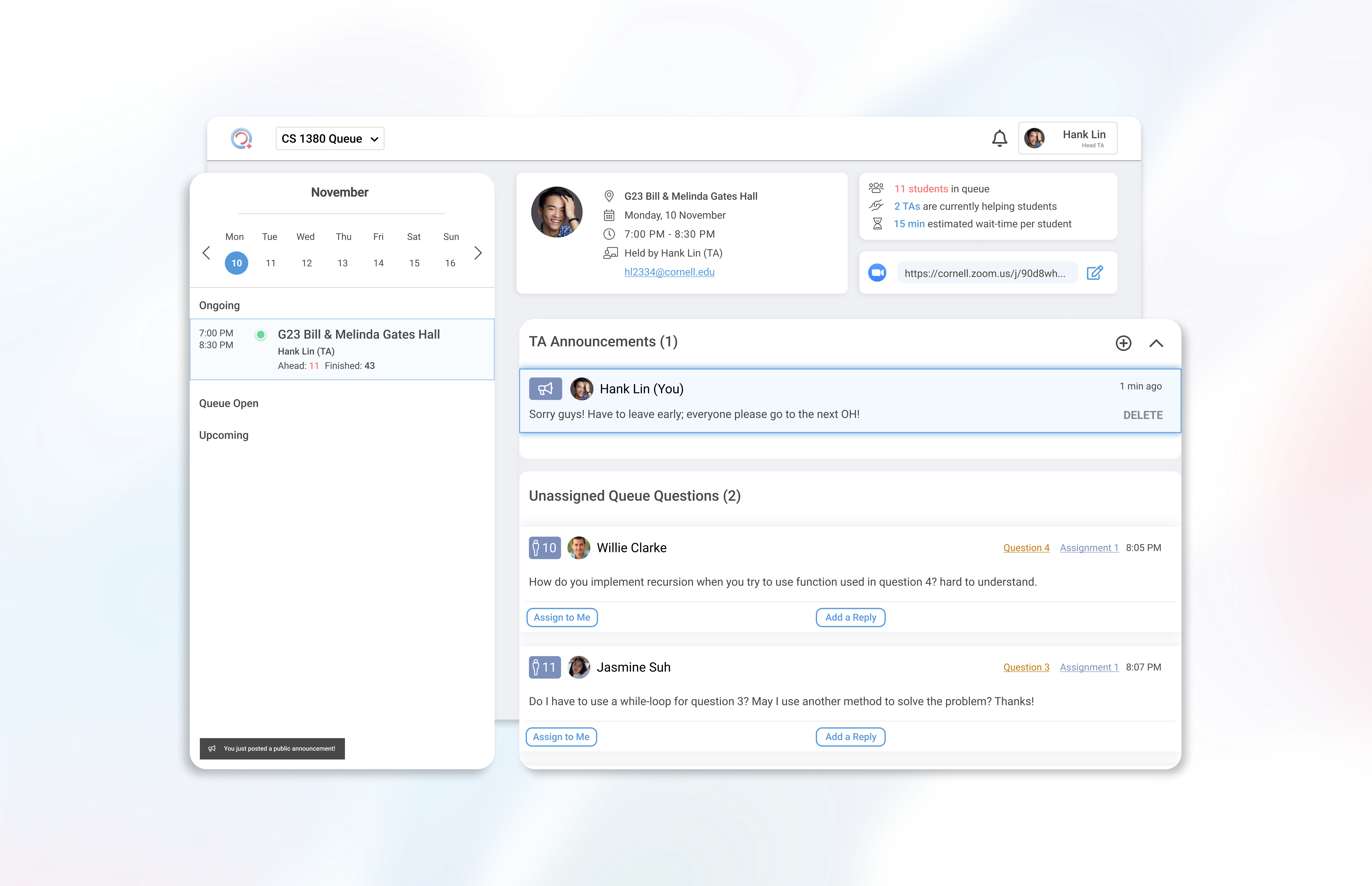
During office hours, TAs want to inform all students of important messages efficiently, but they can't due so due to the current 1-to-1 question-reply system.
Business Goal
Retain user satisfaction and attract more classes to adopt Queue Me In.
Solution
A new TA announcement feature for all students in the queue.
Context
In-person office hours can be too crowded or unorganized. Queue Me In removes these problems by creating an online queue system that allows students to ask questions and TAs to assign themselves to individual students in an orderly fashion.
Student View
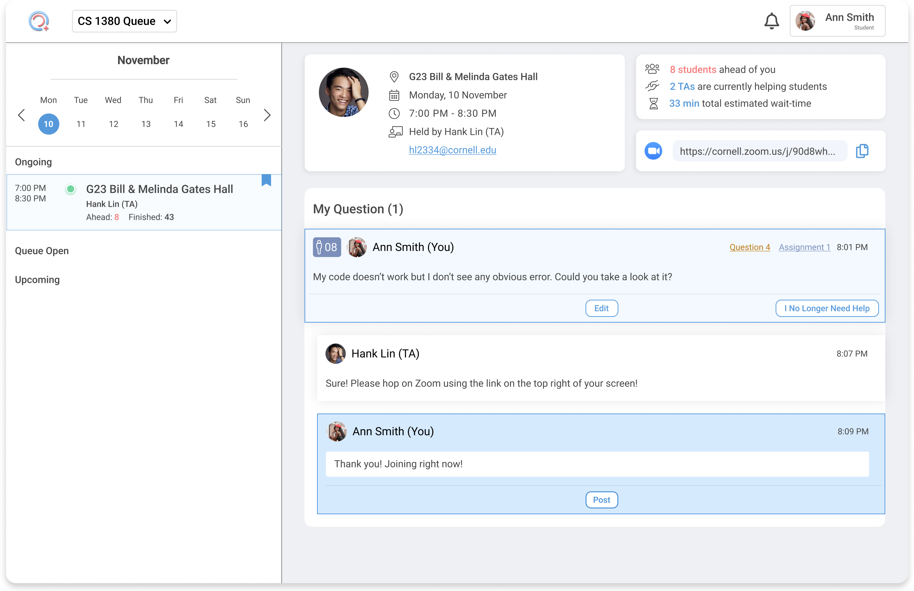
As soon as the office hour starts, students can post homework or exam-related questions onto the board. The system places them in a queue on a first-come, first-serve basis. Right before their turn, the student will get a web/phone notificaion, and a TA will help them either via text reply or 1-on-1 Zoom meetings.
TA View
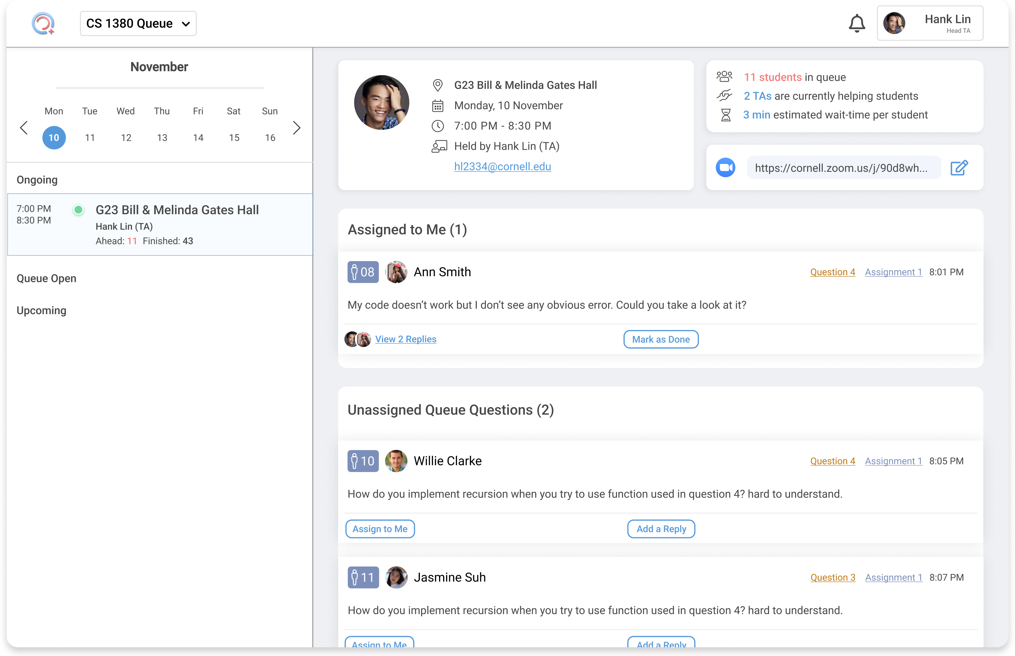
Appointed by a Head TA (postgraduate student), all TAs working in the office hour can assign a number of individual student questions to themselves, before assiting those students. The TA can only communicate with one student at a time.
Research
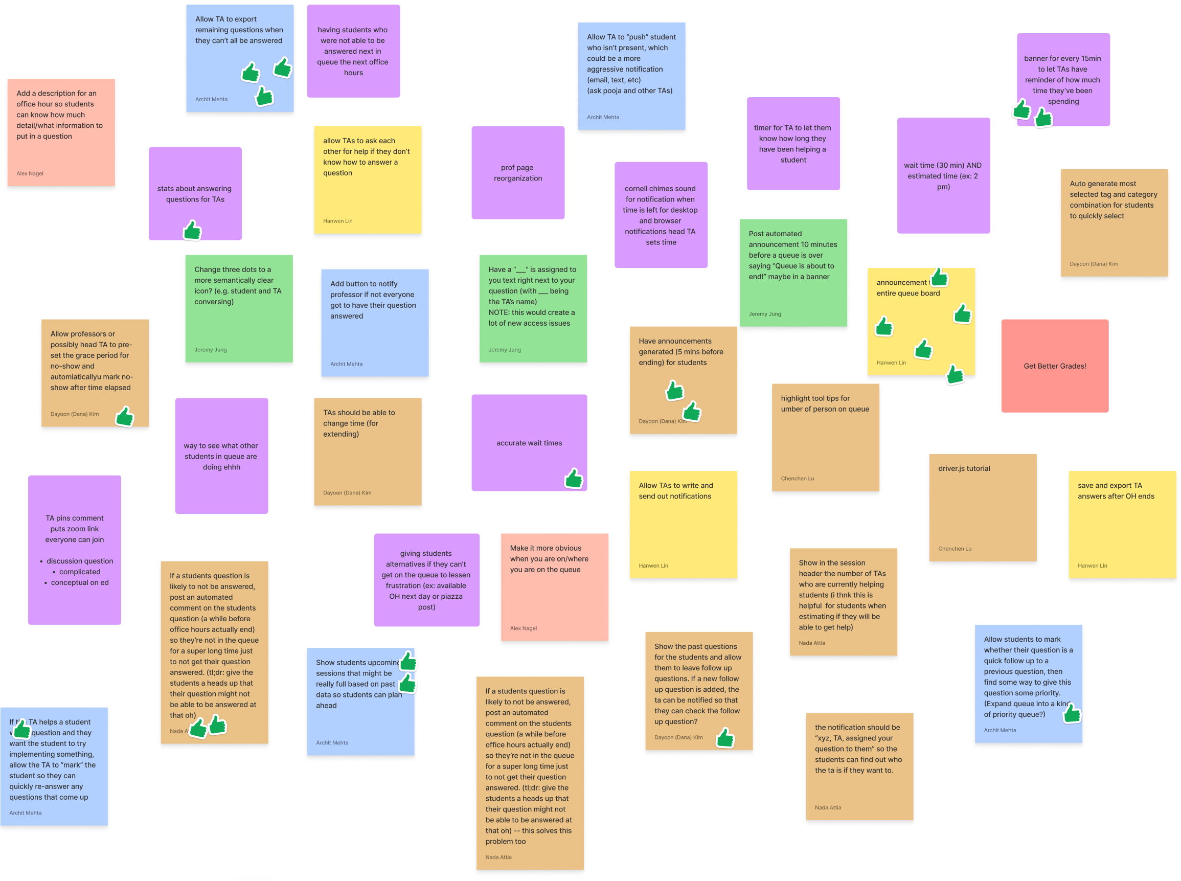
In the end of Fall '21, I organized a team reflection session, in which all Queue Me In developers, PMs and designers identified the top 3-5 problems within the then product. We would then make user interview plans and ideate solutions in spring. And among the many problems, one stood out:
"[there] is no way for TAs to communicate to the entire queue."
Granted, Queue Me In's main mission is to facilitate 1-on-1 help-seeking and assistance between students and TAs. But just like during in-person office hours, we hypothized that TAs on our platform also had a need to broadcast general messages to all students in line.
Insights
Early on in Spring '22, we interviewed 5 TAs. And their responses verified our hypothesis:
- When TAs were unable to assign more students to themselves, they wanted to inform everyone at once, but could not do so due to the limit of the individual reply system.
"I had to manually reply to every student to tell them to leave or go to the next OH." - TAs also experience frustration when students would ask inappropriate questions.
"I wanted to tell everyone that I was not allowed to write their code! It's course policy!" - Occasionally, TAs needed to end their office hours early due to personal reasons. But once again, they had no way of informing the students.
Ideation
Following user research insights, I came up with the following 3 HMWs:
- HMW let TAs convey a messages to all students at once?
- HMW make sure that students would know about those TA messages?
- HMW achieve 1 & 2 without sabotaging QMI's "1-on-1, first-come, first serve" model?
Through these, I was able to narrow down my ideas into 3 solution spaces:
- New Feature: In-App TA Announcement system (Banner Display to Students)
- New Feature: In-App Chat Room
- Make TA announcemenmts via Text Notifications
Prioritization Matrix
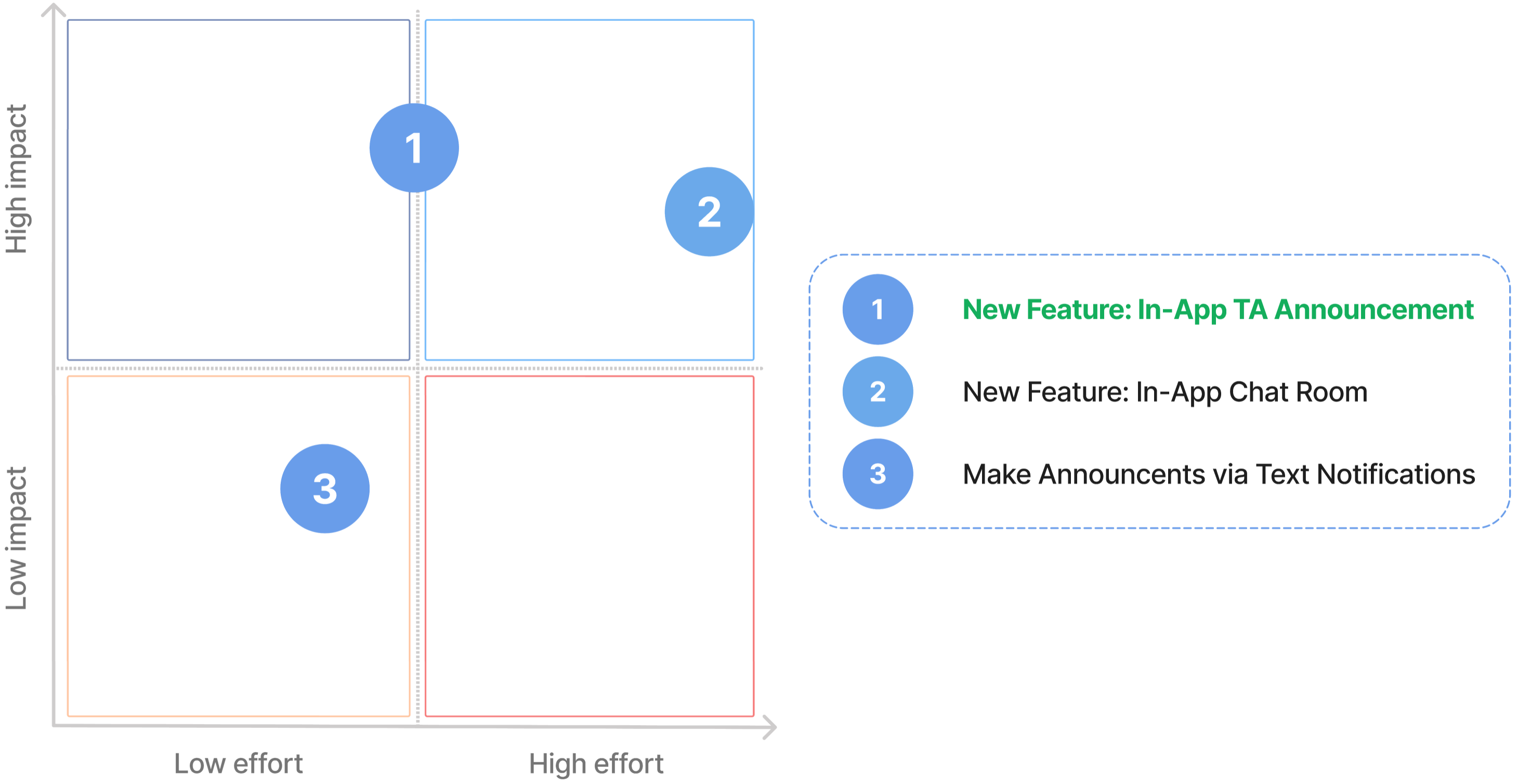
To compare and contrast the impact-effort tradeoff of the three ideas, I created a Prioritization Matrix. I settled on 1 and vetoed 2 and 3, because:
- During office hours, students tend to always stay on the Quueu Me In queue page. An in-app solution would have high discoverability.
- Our developers reported that inplementing a brand new chat room would not be feasible during sprint. Also, students could possibly use it to ask each other questions, which violates the both the model of Queue Me In and course policies.
- Although text notifications has already been in use, data shows low subscription rate.
Mid-Fi Explorations
1. Entry Point
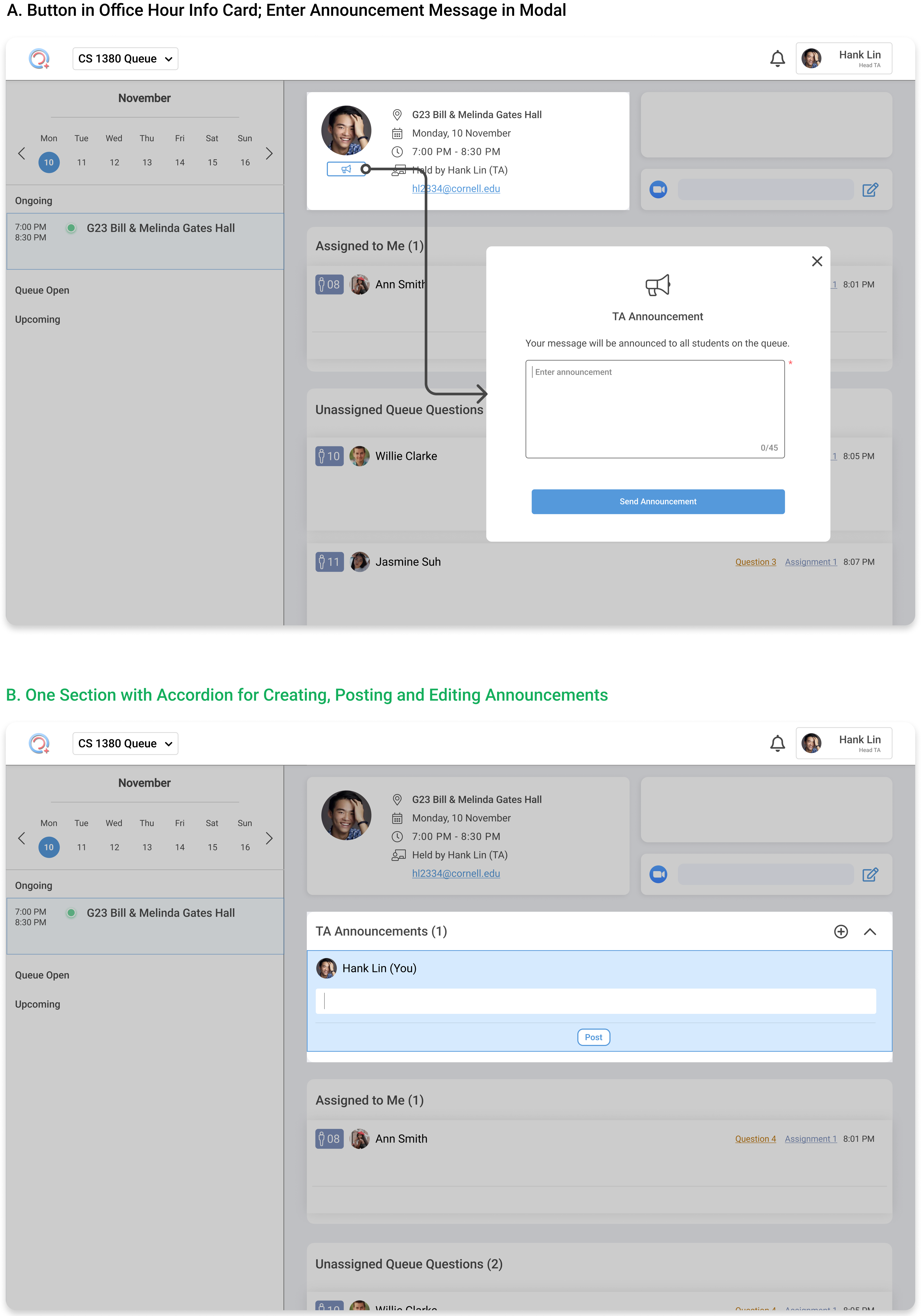
For the starting point of creating an announcement, I chose B for its lower friction and centralized affordances. Although A features a clean button design that is cleverly placed, it requires a modal for every announcement creation and offers NO clear guidance on editing or deleting published announcements. B, on the other hand, will allow for smooth and easy management of all announcements through a dedicated section. I am also aware of the tradeoff of vertical space in B, which is why I added an accordion.
2. TA View:
Published Announcements
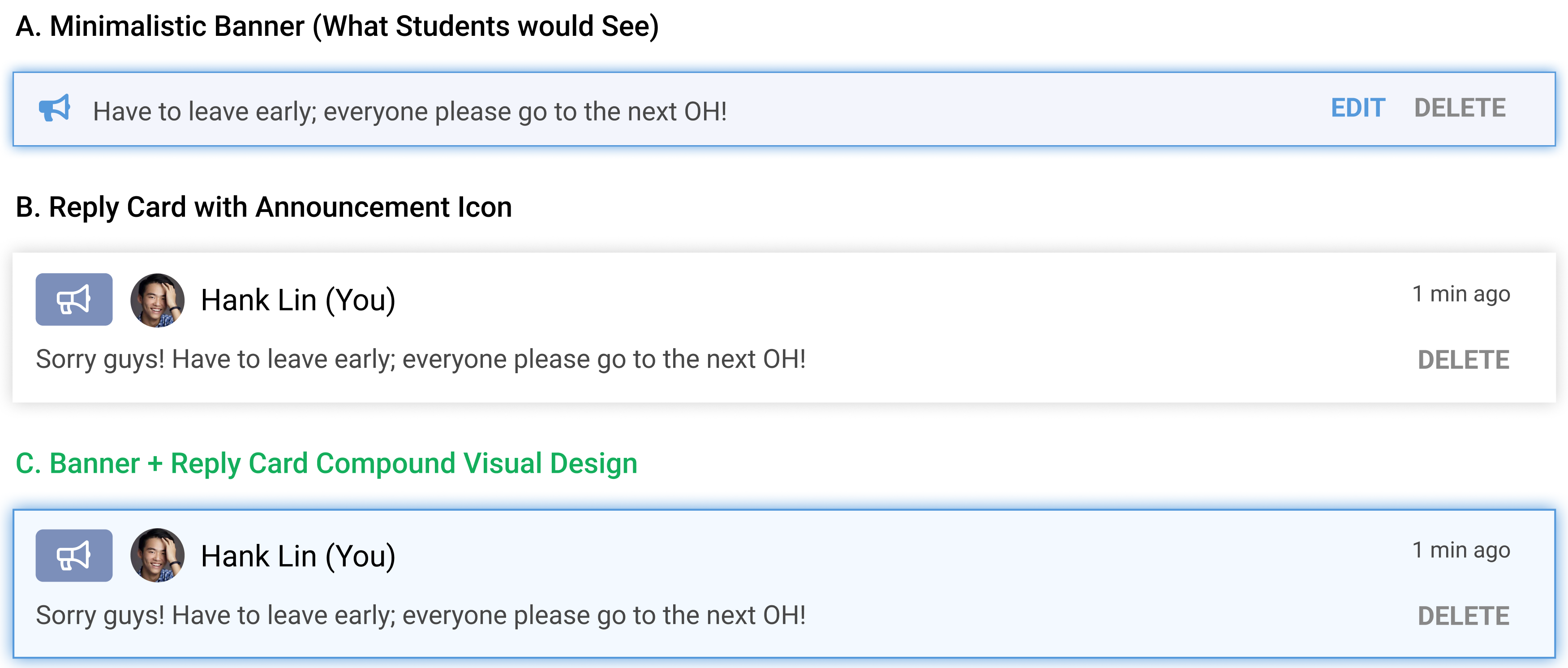
For the TA view of published announcements, I chose C for its visual consistency with both what student sees (TA announcements as blue banners) and what TAs are used to posting (i.e., replies that are displayed in cards). The visuals of published announcements should clearly convey that they are posted by TAs (just like the replies), and that they are exactly what the students see minus the delete button. Other decisions I made include adding the TA's information and not including an edit button, because there could be multiple TAs posting announcements in the same office hour and edited time-sensitive announcements could spark confusion among students, respectively.
Hi-Fi Solution
1. TA View
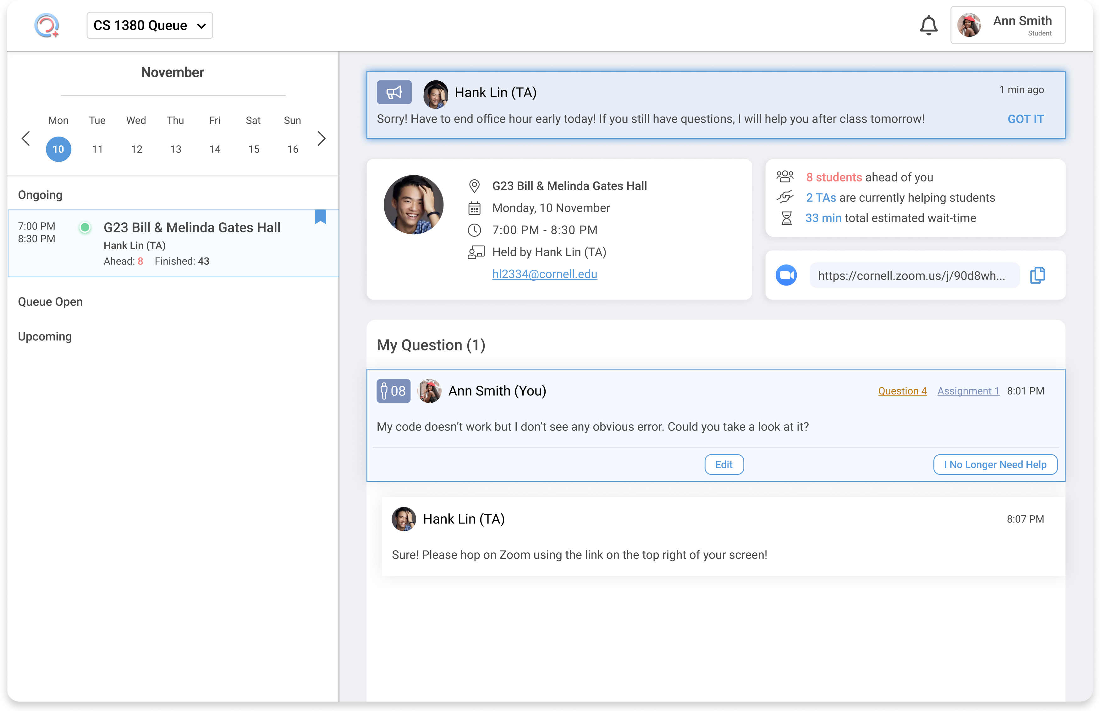
2. Student View
Reflections
After two years as the lead designer for Queue Me In, I have learned how to initiate, ideate, iterate and make final decisions on a new feature. I attribute such an ability to my thorough understanding of the product and its users, my growing UI/UX skills, and most importantly, constant support from all my subteam teammates. I would also like to thank my all designers at my project team for their valuable feedback at crit.
The main lesson I learned from this sprint is that visual details matter. There are a hundred different ways to display TA announcements, but I must try my best to find the one that would best embody the most comprehensible signifiers, help convey the clearest messages, and avoid disrupting the current design system. Attention to details means paying attention to every last pixel, drop shadow and line-width.
Looking ahead, this TA announcement feature may need modifications following Queue Me In's expansion to Stanford University. Originally designed for Cornell classes only, this and other features may need to adapt to Stanford standards. I am confidently passing the torch down to the younger designers on the team.
© Hank Lin 2023
